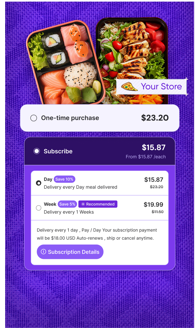

What Are Visual Reports in Subscription Management?
Visual reports are graphical representations of key subscription metrics—like churn rate, revenue trends, customer lifetime value, or active subscribers—designed to provide clarity at a glance. Instead of combing through spreadsheets, merchants can use visual dashboards to quickly spot patterns, assess performance, and make informed decisions.
In subscription apps, these visuals often include line charts, bar graphs, pie charts, and interactive dashboards that track KPIs in real time. They help simplify analytics, especially for non-technical users, while improving overall business oversight.
How Visual Reports Improve Decision-Making
Visual reports eliminate guesswork. They provide instant clarity on what’s working and what’s not—whether it’s a drop in recurring revenue, a spike in cancellations, or a successful upsell campaign.
By tracking trends visually, store owners can make data-backed decisions faster—adjust pricing strategies, fine-tune subscription plans, or test new offers based on actual behavior rather than assumptions.
Why Visual Reporting Matters for Subscription Growth
A good visual reporting system keeps you proactive, not reactive. It’s easier to forecast revenue, understand customer behavior, and optimize performance when insights are displayed visually and updated in real time.
In a competitive subscription economy, the ability to read and act on data quickly can be the edge that drives growth and improves retention.